

Home Interior Color Trends That Feel Timeless
Home Interior Color Trends That Feel Timeless
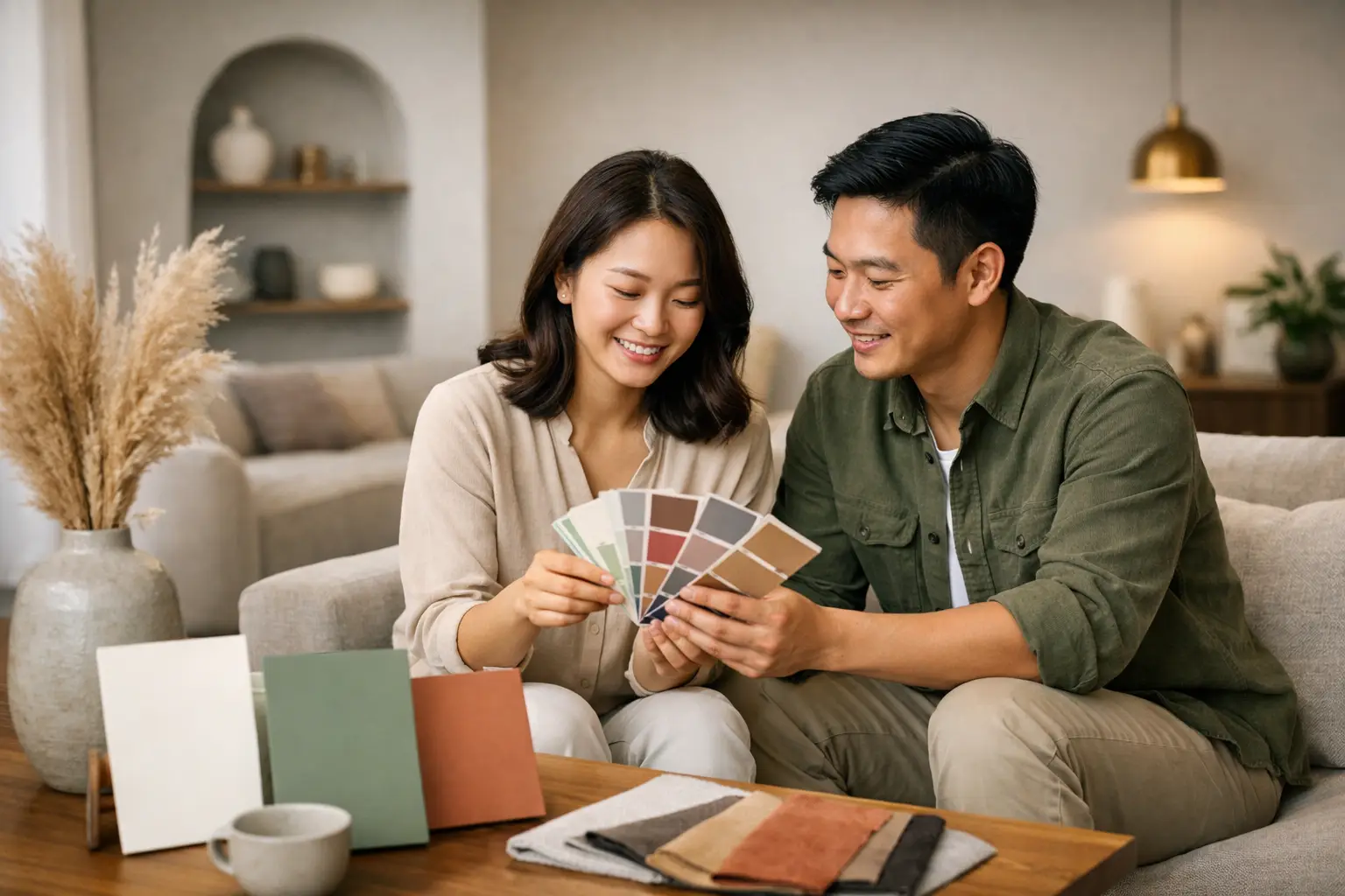
A home can have beautiful millwork, excellent lighting, and thoughtfully selected furniture, yet still feel unsettled when its colors do not relate to one another. The most compelling home interior color trends are moving away from quick visual impact and toward palettes that create calm, depth, and a stronger sense of personal identity.
For homeowners planning a renovation, color is no longer a final decorative layer. It is a design decision that affects how large a room feels, how light moves through it, and how comfortably it supports daily life. The direction is clear: warmer foundations, nature-informed hues, and considered contrast are replacing the cool, all-white interiors that once defined modern living.
Home Interior Color Trends Are Becoming More Grounded
The prevailing palette is warmer, softer, and more nuanced than the stark gray-and-white schemes of recent years. Think mushroom, oat, sand, putty, camel, clay, and softened taupe. These colors are not necessarily dramatic, but they give a room presence. They also work exceptionally well with the natural finishes now common in contemporary homes: light oak, walnut, travertine, textured stone, brushed metal, and handmade-look tiles.
Warm neutrals are often mistaken for safe choices. Used well, they are anything but generic. A cream with a yellow undertone feels different from one with a hint of gray; a taupe may read refined and architectural in one room, then appear dull in another with insufficient daylight. The quality of light, orientation of the home, and surrounding materials all influence the final result.
This is especially relevant in apartment living, where a cohesive palette can carry the eye through connected living, dining, and kitchen zones. Rather than treating each room as a separate color story, a considered base palette creates continuity while allowing each area to retain its own character.
The shift from cool gray to expressive neutral
Cool gray is not gone entirely, but it is increasingly being balanced with warmth. In a modern minimalist home, a greige wall may be paired with oak cabinetry, bronze hardware, and cream upholstery. In a modern luxury setting, deeper mushroom tones can sit alongside veined stone and dark timber for a more tailored expression.
The goal is not to make every surface beige. It is to use neutral colors with enough undertone and material contrast to feel intentional. A flat, single-note scheme can feel sterile. Layered neutrals feel composed.
Earthy Accents Bring Rooms Into Focus
Alongside warm neutrals, muted earth colors are giving interiors a sense of confidence. Olive, sage, terracotta, tobacco, oxblood, mineral blue, and deep cocoa are appearing in feature walls, built-in cabinetry, upholstery, and smaller architectural moments.
These hues work because they are familiar to the eye. They recall landscape, soil, weathered plaster, foliage, and natural stone. In a home designed for rest and everyday rituals, that connection can make contemporary spaces feel more grounded.
Green remains one of the most versatile choices. A softened olive works beautifully in a kitchen or study, particularly with oak and warm off-white surfaces. A deeper forest green can create a more dramatic dining space or entryway. Blue is becoming less icy and more mineral-based, with slate, denim, and smoky blue offering a quieter alternative to bold navy.
Terracotta and clay deserve careful placement. They bring warmth to a room quickly, but their effect depends on proportion. A full clay-colored living room may feel enveloping in a large, light-filled landed home, yet overly heavy in a compact apartment. In smaller spaces, these tones often perform better on a single wall, a niche, a headboard panel, or through textiles and artwork.
Darker Tones Are Used as Architecture
One of the more sophisticated interior color trends is the use of dark color to define rather than simply decorate. Charcoal, espresso, blackened brown, aubergine, and deep green are being applied to joinery, door frames, display niches, and selected walls.
A dark built-in can anchor an open-plan room, giving it visual weight without clutter. Darker cabinetry may also make a kitchen feel more refined when balanced with pale countertops, warm lighting, and enough breathing room around it. In bedrooms, a deep headboard wall can create intimacy and make lighter bedding appear more inviting.
There is a trade-off. Dark finishes absorb light, so they need careful planning in homes with limited natural daylight. A room does not need to be large to carry a dark tone, but it does need balance. Reflective surfaces, layered lighting, and lighter adjacent finishes help prevent the result from feeling closed in.
Color drenching, with restraint
Color drenching, where walls, trim, doors, and sometimes ceilings share a closely related shade, continues to influence design. Done well, it makes a room feel deliberate and immersive. It can also visually simplify awkward corners, bulkheads, or uneven proportions.
For most homes, the strongest interpretation is not necessarily the darkest. A soft olive study, a dusty rose powder room, or a warm gray bedroom can achieve the same enveloping quality while remaining easy to live with. A slightly varied finish on the ceiling or trim preserves depth without interrupting the overall effect.
Material and Color Must Be Designed Together
Paint swatches alone cannot define a successful palette. Color changes significantly beside wood grain, stone, fabrics, metals, and flooring. A white that looks clean against a sample card may appear pink beside walnut, or green beside a particular marble slab.
This is why the most successful schemes are material-led. Start with the finishes that are hardest and most expensive to change, such as flooring, kitchen countertops, fixed cabinetry, and bathroom tiles. Then develop wall colors, fabrics, and decorative accents around them.
In a Japandi-inspired interior, for example, warm white walls may support pale wood, linen, and charcoal accents. A Wabi-Sabi direction may introduce plaster-like finishes, clay hues, and irregular stone textures. In a modern contemporary home, a richer contrast of smoky glass, dark timber, and soft beige can create a polished, layered result.
The color should support the concept, not compete with it. A highly veined stone surface may already provide enough visual movement, while a quiet limestone floor can accommodate a more expressive wall or cabinet color.
How to Choose a Palette That Will Last
Trends are useful when they offer a starting point, not when they dictate every decision. A lasting palette usually has three levels: a calm base, a supporting mid-tone, and a more distinctive accent. The base occupies the largest surfaces, the mid-tone shapes furniture or joinery, and the accent delivers personality in selected areas.
Consider how each room is used before deciding how far to push color. A living room that hosts family gatherings may benefit from warm, adaptable neutrals. A bedroom can support a more cocooning tone. A compact guest bathroom is often an ideal place for a bolder color because its limited scale makes the choice feel curated rather than overwhelming.
It also helps to test samples in the actual home. View them in morning light, afternoon sun, and artificial lighting at night. Place the samples next to flooring, cabinetry, and upholstery rather than judging them in isolation. This small step can prevent costly surprises after painting begins.
For resale-conscious homeowners, the answer is not to eliminate character. It is to place personality where it can be refreshed more easily. A well-designed neutral foundation with colored paint, cushions, artwork, or a statement chair can remain flexible as tastes evolve.
Designing a Home That Feels Like Yours
The strongest color palettes do not chase novelty. They make a home feel more like the people living in it: calm or energetic, understated or expressive, quietly luxurious or warmly informal. At Space Atelier, this is where tailored design matters most. The right colors respond to the home’s layout, its daylight, its materials, and the lifestyle unfolding within it.
Choose the tone that makes you want to stay in the room a little longer. That instinct, supported by thoughtful planning and well-resolved materials, is often more enduring than any trend forecast.
Do you have any enquiry?
Send us an enquiry! Let’s change ideas about what you want for your space.
CONTACT US